• Skip to primary navigation
  • Skip to main content

frankdenneman.nl

  • AI/ML
  • NUMA
  • About Me
  • Privacy Policy

10 guidelines for creating good looking diagrams

February 1, 2013 by frankdenneman

Frequently I receive the question which application I use to create my diagrams. I used to use Microsoft Visio but starting to use Omnigraffle a year ago. However I feel it’s not the program that makes these diagrams. Although it’s true that some functionality help me to create the diagrams more easily, it’s more about following some basic guidelines. I’ve picked up these guidelines along the way, they work for me and hopefully they can help you too.
1: Find a suitable color scheme
A color scheme plays a very important role in a diagram. Colors have various functions within a diagram. I like to use various tints of a color to indicate a relation between objects, whether it has to indicate a relation within the same structure layer or the same consumer or provider. For example all storage related functions or objects have different shades of blue or resource pool structure of customer A have different shades of green.
Picking the correct color for a diagram is very difficult and trying to select the perfect collection of colors wasted (I should say invested) many hours of my life. During that time I learned a lot, here are a few tips:

  • Use a color scheme that provides contrast between different objects.
  • Use the wheel of color to easily select complimentary colors (Colors on opposite sides of the color wheels). I prefer using multiple triad (3-point) complement color schemes.
  • When using multiple triads, uses colors of similar saturation levels. Saturation refers how a “color” appears under a particular lighting condition. Mixing primary and secondary colors with similar saturation levels provides a more cohesive looking design. For example, a bright red color mixed with a blue-ish green color can give some strange effects, sometimes giving the illusion of vibrating when not looking directly at them (very annoying).
  • Use a limited set of colors, don’t allow your diagram to become the poster-child for circus publication guidelines.

Resources:

  • Smashing magazine have published an excellent series on color theory
  • colorschemedesiginer.com shows the Color wheel, use the triad function

2: Fonts
Besides legibility and readability a proper font (typeface) makes the diagram “look right”. Objects and fonts are interrelated when it comes to conveying a subject. Both the font type and the objects in the diagram translate and visualize an idea or concept. Colors evoke feelings and moods, while the font determine the tone of voice in which the message is broadcasted.
Two major categories of typefaces can be identified in the world of fonts. Serif and sans-serif. Serif fonts can be recognized by having small lines at the end of the strokes of a letter. Times new roman is a good example of a serif font. Serif fonts mimic handwriting and can provide a outdated but also formal feeling. Sans-serif fonts lack the small lines and provide a much cleaner and modern look. I have seen diagrams illustrating technologies and features that weren’t released yet, but still gave me an outdated, well-worn feeling. Try use sans-serif fonts when creating computer technology related diagrams.

  • Use a sans-serif font (PT sans or corbel are excellent choices)
  • Try to use a font that compliments the font used in the articles
  • Use a single font in a diagram; use different font weights (light, medium, bold) to emphasize.
  • Color contrast; use dark colors on white background, white on black background. Tip: dark blue on white gives a rich feeling to the labels.
  • Use handwritten fonts only if you use hand drawn objects. Match font style with objects. Swooping lines as connectors allow for the use of a more elegant font, however keep it in style with your overall blog theme and used fonts.
  • Do not use Comic sans, unless you are diagramming your lemonade stand!

Resources:

  • Google fonts and myfonts.com provide an enormous font collection. Most of them can be downloaded for free.
  • Use whatthefont service to identify a specific font used in an image.


3: Lines
Lines come in all shapes and forms. Try to be consistent with the types of lines you use. If you use a dashed line for indicating standby functionality, do not use the same line pattern for an active connection. Think about the thickness of the lines used. If you selected a very clean lightweight font, don’t use thick lines for the framework of boxes and other objects. Mix and match line weight with font weight. Strive for balance across the entire diagram.
4: Whitespace
Whitespace or often revered to as negative space is the portion of the diagram left unused. It’s the space between the objects and this is what I believe actually the most important thing to get right. The balance between the positive (objects) and the negative (whitespace) is fundamental to create an aesthetic pleasing diagram. Whitespace can help to emphasize particular elements but also help to balance the objects in the diagram. Using too much whitespace and a relationship between two objects may get lost.

5: Align!
Always align objects horizontally and if applicable vertically. These details matter. It might not be easily identified by eye, but your subconscious picks it up and alerts you “something is not right”. Most people tend to shy away and that’s conflicts the first reason why you made the diagram. To help people better understand the subject by creating additional visual aids. Omnigraffle is far more advanced than Visio when it comes to auto alignment. Omnigraffle provides automatic guides displaying the white space between objects in the same line. That feature saved me many hours
6: Go minimal
Try to reduce the number of objects as much as possible. Get to the essence of the subject as much as possible. IT people like to put in as much as detail as possible. If these objects are not relevant to the subject you are trying to depict, leave them out. This increases the focus point of the diagram. Going minimal is harder than it sounds. By using as little objects as possible you spend a lot time focusing on spacing, positioning, typography and contrast.
7: Shadows
The novelty of shadows beneath lines and boxes wear off quickly. After viewing the diagram a couple of times, the shadows give the diagram an unclean and grimy feeling. It doesn’t look clean, fresh and rapidly feels outdated after seeing the diagram a couple of times. My advice: Try to avoid it as much as possible.
8: Real men make block diagrams
Sometimes I jokily reply this when somebody is asking for vendor stencils and icon-packs on twitter. Vendor stencils can be very useful for some types of diagrams, for example wiring diagram of a core Ethernet switch. I prefer to stay away from using pre-made icons in diagrams indicating architecture or relationships. Pre made icons come in their own color scheme and are usually in an isometric perspective to give that 3d feel. Forcing you to design the whole diagram in an isometric perspective. Certain Icon designs distract the viewer, reducing the ability of the diagram to convey the message. By creating your own objects, you can choose your own color scheme, your own level of detail, and your own direction of perspective.
9: Commit to a single perspective
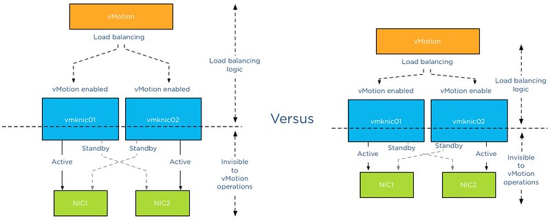
Already mentioned in the number 8, when using an icon in isometric perspective commit to drawing in an isometric perspective. The viewpoint of an isometric diagram is slightly rotated to reveal other surfaces than those visible from a top-down perspective. Isometric diagrams are a great way for illustrating all the physical components of (virtual) architectures. A while ago I stumbled upon an old isometric diagram I created for a client of mine. Mixing isometric icons with top-down icons provides an unbalanced view. Usually the lines do not connect well or are just to complete parallel or horizontally aligned, providing hours of frustration to the stickler for details.
Isometric diagram of virtual infrastructure
10: Relevance
A picture is worth a thousand words, but don’t draw a giraffe after you wrote three paragraphs about the feeding habits of elephants. This is an extreme example, but use a diagram to help the reader to understand the aspect of the topic and assist him with the identification of the subject. Don’t allow a diagram to confuse your audience. I’ve seen countless diagrams in VCDX architecture designs of arrays connected to an FC architecture, when the candidate was using an iSCSI. If you use 6 LUNs, don’t use a diagram that shows an object with the words “LUN 1 …. LUN 99” in it. Allow the diagram relay information to strengthen the written word.
Be consistent and have fun
In almost all of the other guidelines I provide examples why consistency is important. It helps the reader to identify components and their relation more easily. Especially when you use a series of diagrams in the same presentation or publication. Do it well and allow it to become your trademark. But most of all have fun while creating diagrams. It shows!

Filed Under: Miscellaneous

From the archives – An old Isometric diagram

October 5, 2012 by frankdenneman

While searching for a diagram I stumbled upon an old diagram I made in 2007. I think this diagram started my whole obsession with diagrams and to add “cleanness” to my diagrams.

This diagram depicts a virtual infrastructure located in two datacenters with replication between them. This infrastructure is no longer in use, but to make absolutely sure, I changed the device names into generic text labels such as ESX host, array, SW switch, etc. Back then I really liked to draw Isometric style. Now I’m more focused onto block diagrams and trying to minimalize the number of components in a diagram. In essence I follow the words from Colin Chapman: Simplify, then add lightness. But then applied to diagrams 🙂
The fact that this diagram is still stored on my system tells me that I’m still very proud of this diagram. So that made me wonder, which diagram did you design and are you proud of?
Get notification of these blogs postings and more DRS and Storage DRS information by following me on Twitter: @frankdenneman

Filed Under: Miscellaneous

Removing the horizontal bar in the footer of a word doc

July 20, 2012 by frankdenneman

Now for something completely different, a tip how to extend your life with about 5 years – or how to remove the horizontal bar in the footer of a word document.
Unfortunately I have to deal with the mark-up of word documents quite frequently and am therefor exposed to the somewhat unique abilities of the headers and footers feature of MS-Word. During the edit process of the upcoming book, Word voluntarily added a horizontal bar to my footer. Example depicted below.

However word doesn’t allow you to highlight and select a horizontal bar and therefor cannot be easily removed by pressing the delete button.
This means you have to explore the fantastic menu of word.
To remove the bar:
1. Open the footers section, by clicking in that area in the document.
2. Go to menu option Format
3. Borders and Shading
4. The borders and shading menu shows the line that miraculous appeared in my footer, by selecting the option None at the right side of the window it removes the horizontal bar from the footer.

5. Click OK
I hope this short tip helps you to keep the frustration to a minimum.

Filed Under: Miscellaneous

Whiteboard desk

May 3, 2012 by frankdenneman

As I’m an avid fan of “post your desk topics \ workspace ” forum threads, I thought it might be nice to publish a blog article about my own workspace. I always love to see how other people design their work environment and how they customize furniture to suit their needs. Hopefully you can find some inspiration in mine.
Last year I decided to refurbish my home office. To create a space that enables me to do my work in the most optimum way, and of course that is pleasing to the eye. The first thing that came to mind was a whiteboard and a really big one. So I needed to build a wall to hang the whiteboard, as the room didn’t had any wall that could hold a whiteboard big enough. After completion of the wall, a 6 x 3 feet wide whiteboard found its way to my office.
whiteboard
Although its roughly 5 to 6 feet away from my desk, I realized I didn’t use it enough due to distance. Sitting behind the desk while on the phone or just using my computer, I found myself scribbling on pieces of paper instead of getting out of my chair and walk over to the whiteboard. Therefor I needed a small whiteboard I could grab and use at my desk. It seemed reasonable, however I like minimalistic designs where clutter is removed as much as possible. I needed to come up with something different; enter the whiteboard desk!
whiteboardesk00
Whiteboard desk
Instead of buying a mini whiteboard that needs to be stored when not used, I decided to visit my local IKEA and see what’s available. Besides “show your desk” threads I hit ikeahackers.net on a daily basis. While looking at tables, I noticed that the IKEA kitchen department sells customized tabletops. Each dimension is possible in almost every shape. I decided to order a 7 feet by 3 feet high-gloss white tabletop with a stainless steel edge. The Ikea employee asked where to put the sink, she was surprised when I told her that the tabletop was going to function as a desk.
whiteboarddesk03
I chose to order the 2 inch thick tabletop as I need to have a desktop that is sturdy enough to hold the weight of a 27” I-mac and a 30” TFT screen. The stainless steel edge fits snug around the desk and covers each side; it doesn’t stick out and is not noticeable when typing. It looks fantastic! However the downside is the price, it was more expensive than the tabletop itself. The alternative is a laminate cover that looks like it will be worn out easily. While spending most of my time behind my desk I thought it was worth the investment of buying the real thing.
The high-gloss finish acts as the whiteboard surface and works like a charm with any whiteboard markers. I left notes on my desk for multiple days and could be removed without leaving a trace.
whiteboarddesk04-2
The tabletop rest on two IKEA Vika Moliden stands, due to the cast of the shadow its very difficult to notice that the color of the stands do not exactly match the color as the stainless steel edge.

The whiteboard desk is just an awesome piece of furniture. When on the phone I can take notes on my desk while immediately drawing diagrams next to it. It saves a lot of trees, saves a lot of time scrambling for a piece of paper, and a pen and decreases clutter on the desk. The only thing you need to do when building a whiteboard desk is to banish all permanent markers in your office. 🙂
endshot
It would be awesome to see what your workspace looks like. What do you love about your workspace and maybe show your own customizations? I would love to see blogs articles pop up describing the workspace of bloggers. Please post a link to your blog article in the comment section.

Filed Under: Miscellaneous

VMworld Public Voting

May 16, 2011 by frankdenneman

VMworld 2011 session voting opened a week ago and there a still a few days left to cast your vote. About 300 in-depth sessions will be presented at VMworld this year and this year two sessions are submitted in which I participate. Both sessions are not the typical PowerPoint slide sessions, but are based on interaction with the attending audience.
 
TA 1682 – vSphere Clustering Q&A
Duncan Epping and Frank Denneman will answer any question with regards to vSphere Clustering in this session. You as the audience will have the chance to validate your own environment and design decisions with the Subject Matter Experts on HA, DRS and Storage DRS. Topics could include for instance misunderstandings around Admission Control Policies, the impact of limits and reservations on your environment, the benefits of using Resource Pools, Anti-Affinity Rules Gotchas, DPM and of course anything regarding Storage DRS. This is your chance to ask what you’ve always wanted to know!
Duncan and I conducted this very successful session at the Dutch VMUG. Audience participation led to a very informative session where both general principles and in-depth details were explained and misconceptions where addressed.
TA1425 – Ask the Expert vBloggers
Four VMware Certified Design Experts (VCDX) On Stage! Are you running a virtual environment and experiencing some problems? Are you planning your companies’ Private Cloud strategy? Looking to deploy VDI and have some last minute questions? Do you have a virtual infrastructure design and want it  blessed by the experts? Come join us for a one hour panel session where your questions are the topic of discussion! Join the Virtualization Experts, Frank Denneman (VCDX), Duncan Epping (VCDX), Scott Lowe (VCDX) and Chad Sakac, VP-VMware Alliance within EMC, as they answer your questions on virtualization design. Moderated by VCDX #21, Rick Scherer from VMwareTips.com
 
Many friends of the business have submitted great sessions and there are really too many to list them all, but there is one I would want to ask you to vote on and that is the ESXi Quiz Show.
 
A 1956 – The ESXi Quiz Show
Join us for our very first ESXi Quiz Show where teams of vExperts and VMware engineers will match expertise on technical facts, trivia related to all VMware ESXi and related products. You as the audience will get 40% of the vote. We will cover topics around ESXi migration, storage, networking security, and VMware products. As an attendee of this session you will get to see the experts battle each other. For the very first time at VMworld you get to decide who leaves the stage as a winner and who does not.
This can become the most awesome thing that ever hit VMworld. Can you think about the gossip, the hype and the sensation will introduce during VMworld? As Top vExperts, bloggers, VMware engineers and the just the lone sys admin (no not you Bob Plankers 😉 ) compete with each other. Will the usual suspect win or will there be upsets? Who will dethrone who? Really I think this will become the hit of VMworld 2011 and will be the talk of the day at every party during the VMworld week.
 
Session Voting is open until May 18, the competition is very fierce and it’s very difficult to choose between the excellent submitted sessions, however I would like to ask your help and I hope you guys are willing to vote on these three sessions.
http://www.vmworld.com/cfp.jspa

Filed Under: Miscellaneous Tagged With: VMworld2011

  • « Go to Previous Page
  • Page 1
  • Interim pages omitted …
  • Page 5
  • Page 6
  • Page 7
  • Page 8
  • Page 9
  • Go to Next Page »

Copyright © 2025 · SquareOne Theme on Genesis Framework · WordPress · Log in